The Ubiquity of Mobile and the Curious Case of the PDF Menu
It’s hardly a revelation to state that we live in a mobile-first world. The vast majority of individuals now access the internet primarily through their smartphones. This shift has rightly prompted businesses across various sectors to ensure their websites are responsive and provide a seamless experience across all devices. Indeed, a mobile-friendly website has transitioned from a desirable feature to an absolute necessity, akin to having a physical address for a brick-and-mortar establishment.
Yet, within this landscape of mobile optimisation, a rather peculiar anomaly persists: the steadfast clinging to PDF menus by a significant number of restaurants. One might jest that they’d sooner part with a prized kitchen appliance than abandon their digital leaflets. However, when one considers the pivotal role a menu plays in attracting and informing potential patrons, this reliance on a static, often unwieldy format becomes truly baffling.
The Menu Page: A Digital Shopfront
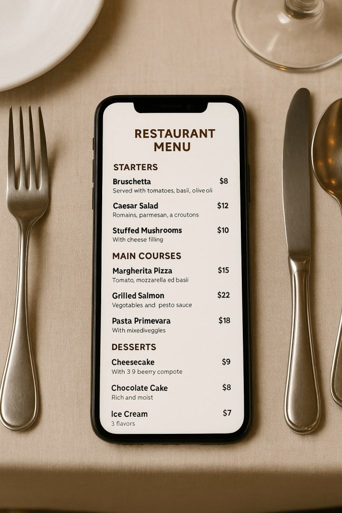
Consider the journey of a prospective diner. They might be searching online for local eateries, perhaps on their commute home or while planning a weekend outing. Upon discovering your website, what is one of the first things they are likely to seek? The menu, of course! It’s the digital equivalent of peering through the window of your restaurant, enticing them with the promise of culinary delights and informing them of pricing and options.
Given this significance, why would a restaurant owner choose to present this crucial information in a format that often requires pinching and zooming on a mobile screen, is slow to load, and can be cumbersome to navigate? It’s akin to placing a blurry, poorly lit photograph of your best dishes in your physical window – hardly the most effective way to entice customers.
The Pitfalls of the PDF Paradigm
The continued use of PDF menus presents a multitude of disadvantages in today’s digital ecosystem:
- Suboptimal Mobile Experience: This is perhaps the most glaring issue. PDFs are inherently designed for printing on a standard-sized page. When viewed on a smaller mobile screen, the text often becomes minuscule, requiring users to zoom in and scroll extensively, leading to frustration and a less-than-appetising user experience.
- Search Engine Visibility Woes: Search engine algorithms, such as those employed by Google, are adept at crawling and indexing text-based content on websites. However, PDFs, particularly those generated as scanned images, present a significant hurdle. If your menu is embedded as an image within a PDF, the delectable descriptions and enticing dish names are essentially invisible to search engines, hindering your restaurant’s discoverability. A well-structured, mobile-friendly menu page, on the other hand, allows search engines to easily understand and index your offerings, potentially improving your website’s ranking for relevant searches.
- Update Inefficiencies: In the dynamic world of restaurant operations, menus frequently require updates due to seasonal changes, ingredient availability, or price adjustments. Modifying a PDF often necessitates engaging a graphic designer, leading to delays and additional costs. A dedicated menu page on your website offers far greater flexibility, allowing for swift and straightforward updates, often through a simple content management system.
- Limited Interactivity and Integration: Unlike a dynamic web page, a PDF menu offers little opportunity for interactivity. It cannot easily integrate with online ordering systems, reservation platforms, or other digital tools that enhance the customer experience. A well-designed menu page can seamlessly incorporate these features, streamlining the customer journey from browsing to ordering or booking a table.
- Accessibility Concerns: PDFs can pose challenges for users with visual impairments who rely on screen readers. If the PDF is not properly tagged or formatted, the information may be inaccessible, potentially alienating a segment of your audience.
The Savvy Solution: Embracing the Mobile-Friendly Menu Page
The alternative, a dedicated, mobile-friendly menu page, offers a wealth of benefits:
- Enhanced User Experience: A responsive menu page adapts seamlessly to the screen size of any device, ensuring a clear, legible, and enjoyable browsing experience for all visitors.
- Improved Search Engine Optimisation (SEO): By presenting your menu in easily crawlable text format, you enhance your website’s SEO, making it more likely for potential customers to find you through online searches.
- Effortless Updates: Modifying your menu becomes a simple and cost-effective process, allowing you to keep your online information accurate and up-to-date without relying on external assistance.
- Seamless Integration: A web-based menu can be readily integrated with online ordering systems, reservation widgets, and other digital tools, providing a more streamlined and convenient experience for your customers.
- Enhanced Accessibility: Well-structured HTML menu pages are inherently more accessible to users with disabilities, ensuring that everyone can access your offerings.
- Centralised Information: Instead of scattering menu PDFs across various platforms, a dedicated page centralises all your menu information in one easily accessible location, simplifying sharing and management.
Visual Appeal and Practicality Combined
Now, one might ponder the role of visuals. Can a mobile-friendly menu page showcase the tantalising presentation of your dishes? Absolutely. While it’s prudent to exercise caution with image-heavy menus, particularly for extensive offerings, strategically placed, high-quality photographs can certainly enhance the visual appeal and tempt potential diners. The key is to optimise these images for web use to ensure fast loading times, even on mobile connections.
In Conclusion: A Recipe for Success
The digital landscape continues to evolve, and customer expectations are constantly being shaped by seamless online experiences. In this context, the reliance on static PDF menus appears increasingly anachronistic. By embracing the power and versatility of a mobile-friendly menu page, restaurants can significantly enhance their online presence, improve customer satisfaction, boost their search engine visibility, and ultimately, create a more robust and successful business. It’s not just about keeping up with the times; it’s about serving up a superior digital experience that truly reflects the quality of the culinary delights within.